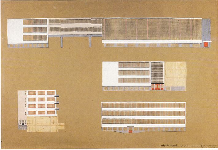
Experimental Colour Plan for the Facade of the Bauhaus Building, Dessau
Hinnerk Scheper, 1926

Versuch einer farbigen Fassadenbemalung des Bauhauses Dessau, Perspektive von Südosten, Autor: Hinnerk Scheper, 1926.
[Translate to English:] text
The colour design for the outer shell of the building complex corresponds with Scheper's concept that colour could and should support the structural impact of the architecture. The strong light/dark contrasts and the individually occurring colour accents were intended to create tension and produce correspondencies that preserve the equilibrium of the facility. For example, the colour red distinguishes the areas of the building that display a certain openness or transparency – doors, windows and balconies – while a circumferential band in a neutral grey interconnectevery part of the building.
- Literature:
- Scheper, Renate (2005): Farbenfroh! Die Werkstatt für Wandmalerei am Bauhaus, Berlin.
- Düchting, Hajo (1996): Stiftung Bauhaus Dessau: Farbe am Bauhaus. Synthese und Synästhesie, Berlin.